
Top Construction Logos: Design Expert Tips for Building Brand Identity
A construction company logo is far more than a visual mark—it’s the foundation of your brand identity and the first impression clients encounter. In an industry where trust, reliability, and professionalism are paramount, your logo must communicate competence and stability at a glance. Whether you’re a residential contractor, commercial builder, or heavy equipment operator, your logo design directly influences how potential clients perceive your business capabilities and credibility.
Construction logos face unique challenges. They must remain recognizable across multiple applications—from business cards and hard hats to vehicle wraps and billboards—while maintaining clarity at any size. The most successful construction company logos combine strategic symbolism, thoughtful color psychology, and timeless design principles that resonate with your target market. This comprehensive guide explores proven design strategies, real-world examples, and actionable insights to help you create or refine a logo that builds lasting brand recognition.
Understanding Construction Logo Design Fundamentals
Effective construction company logos share fundamental design principles that transcend industry trends and maintain longevity. The best logos communicate instantly without requiring explanation, function equally well in color and black-and-white, and remain distinctive when scaled from billboard size to favicon dimensions.
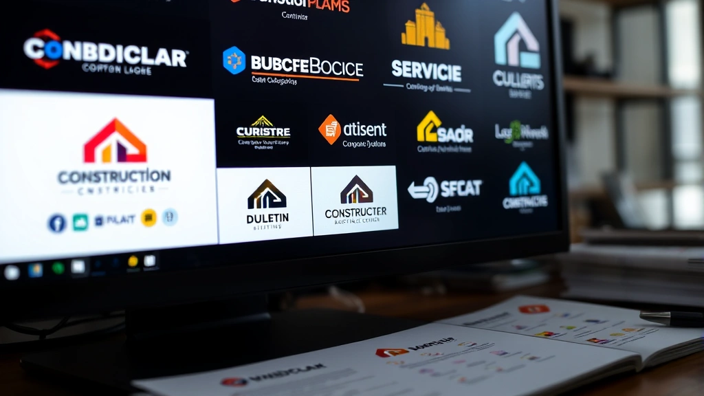
Professional construction logos typically employ one of three primary approaches: geometric abstraction, illustrative representation, or wordmark emphasis. Geometric designs use shapes and lines to suggest structural concepts—think of how angles can imply buildings or strength. Illustrative logos incorporate recognizable construction elements like hammers, blueprints, or building silhouettes. Wordmark-focused designs prioritize typography, allowing the company name itself to become the primary visual identifier.
Your logo’s foundation rests on understanding your specific market segment. A residential home builder’s logo differs substantially from a commercial construction firm or industrial contractor. When researching your website URL company information and competitive positioning, analyze how established firms in your niche approach logo design. This competitive analysis reveals market expectations while identifying opportunities for differentiation.
The simplicity principle cannot be overstated. Construction logos that attempt to incorporate every aspect of the business—blueprints, tools, buildings, and text—create visual clutter that fails to communicate effectively. Industry leaders understand that memorable logos achieve maximum impact through strategic restraint. Your logo should be recognizable and memorable within three seconds of viewing.
Color Psychology in Construction Branding
Color selection in construction logos operates within specific psychological parameters. Different colors convey distinct messages that influence client perception and brand recall. Understanding these associations helps you select colors aligned with your company’s positioning and values.
Blue represents trust, stability, and professionalism—the most common choice across construction industries. Blue conveys reliability and competence, making it ideal for companies emphasizing safety and quality. Orange suggests energy, enthusiasm, and approachability, working well for companies positioning themselves as innovative or customer-focused. Gray implies sophistication and neutrality, appealing to upscale residential or commercial firms. Green connects to sustainability and environmental responsibility, increasingly important for eco-conscious builders.
Red commands attention and suggests urgency or power, though overuse can appear aggressive. Black conveys sophistication and strength, particularly effective when combined with accent colors. Yellow promotes optimism and visibility, though bright yellow can appear less professional than darker, saturated tones.
Most successful construction logos employ two to three colors maximum. This restraint ensures versatility across applications and maintains visual clarity. Your primary color should dominate, with secondary colors providing accent and contrast. Consider how your color palette functions in single-color applications—vehicle wraps, uniforms, and safety equipment often restrict color options.
Cultural considerations influence color selection as well. Different markets associate colors with varying meanings. When expanding into new regions or searching for regional company information, research local color associations to ensure your palette doesn’t inadvertently communicate unintended messages.
Typography and Font Selection
Typography plays a crucial role in construction logo design, whether your logo incorporates a wordmark or includes company name beneath a symbol. The typeface you select communicates personality, professionalism, and industry positioning before anyone reads the actual words.
Serif fonts (fonts with small lines extending from letter edges) convey tradition, established credibility, and formality. These work well for established firms emphasizing heritage and experience. Sans-serif fonts (clean fonts without serifs) suggest modernity, efficiency, and clarity. Sans-serif dominates contemporary construction branding, offering superior legibility across digital and print applications.
Custom or modified typefaces offer competitive advantage by creating distinctive brand identity. However, this approach requires investment in professional design and careful consideration of legibility, particularly at smaller sizes. Many successful construction firms use modified versions of existing typefaces, adjusting weight, spacing, or letter forms to achieve uniqueness while maintaining professional polish.
Font weight significantly impacts construction logo effectiveness. Heavier weights suggest strength and stability—qualities clients seek in construction partners. However, excessive weight can reduce legibility, particularly in smaller applications. Balanced font weights typically range from medium to bold, providing visual impact without sacrificing clarity.
Letter spacing (kerning) deserves careful attention. Tight spacing suggests precision and efficiency, while generous spacing conveys openness and confidence. Construction logos typically employ slightly tighter-than-standard spacing, reinforcing professional competence and attention to detail.
Symbolism and Visual Elements
Construction logos leverage specific visual symbols that instantly communicate industry affiliation and company capabilities. Understanding symbolic associations helps you select elements that reinforce your brand positioning.
Structural elements like buildings, skyscrapers, or architectural forms directly communicate construction expertise. These work particularly well for commercial builders and general contractors. Tools and equipment—hammers, wrenches, hard hats—suggest hands-on capability and craftsmanship. Geometric shapes like squares, triangles, and rectangles imply structural integrity and precision.
Upward-pointing elements suggest growth, progress, and aspiration. Construction logos frequently incorporate ascending lines, rising buildings, or upward-facing shapes to communicate positive momentum and success. Solid, grounded forms convey stability and reliability—essential qualities for construction brands.
Abstract representations often outperform literal illustrations in construction logos. Rather than depicting a hammer in photorealistic detail, consider how geometric abstraction of tool shapes creates sophistication and memorability. This approach allows multiple interpretations while maintaining clarity and professional polish.
Incorporating your company’s unique value proposition into logo symbolism strengthens brand differentiation. If sustainability is central to your business model and competitive positioning, consider environmental symbolism. If specializing in heritage restoration, incorporate historical design elements. This thoughtful symbolism helps your logo tell your company’s story.
Scalability and Versatility Requirements
Construction logos must function flawlessly across extreme size variations—from massive billboard installations to favicon-sized website icons. This scalability requirement eliminates certain design approaches and demands careful technical consideration.
Line weight consistency ensures logos maintain visual integrity when scaled. Extremely thin lines disappear when logos shrink to small sizes, while overly thick elements create visual heaviness at larger scales. Professional construction logos employ moderate line weights that remain visible at small sizes while avoiding visual dominance at large scales.
Negative space becomes increasingly important in scalable designs. Logos relying on intricate details or complex negative space relationships may lose definition when scaled down. The most versatile construction logos maintain clear positive-negative relationships that remain obvious regardless of size.
Your logo requires multiple variations for different applications. A full-color version for digital and print media, a single-color version for monochrome applications, and a simplified version for small-scale use ensure consistent brand presentation across contexts. Professional logo packages typically include 5-10 variations addressing different use cases.
Testing your logo at actual application sizes reveals potential issues before implementation. What appears perfect on your computer screen may fail when scaled to favicon size or enlarged to billboard dimensions. Comprehensive testing across applications prevents costly redesigns and ensures professional brand presentation.
Industry-Specific Design Trends
Construction logo design reflects broader industry trends while maintaining timeless appeal. Understanding current trends helps you create contemporary designs that won’t appear dated within a few years.
Contemporary construction logos increasingly favor minimalist aesthetics, stripping away unnecessary details to reveal essential brand elements. This trend reflects broader design evolution toward simplicity and clarity. Minimalist construction logos often employ single-color palettes or limited color combinations, enhancing versatility and visual impact.
Geometric modernism continues dominating construction branding, with logos incorporating clean lines, precise angles, and mathematical relationships. This approach communicates precision, professionalism, and technical expertise—qualities clients value in construction partners.
The trend toward custom typography reflects growing emphasis on distinctive brand identity. Rather than relying on standard fonts, forward-thinking construction firms invest in custom or heavily modified typefaces that differentiate their brands while maintaining professional credibility.
Subtle gradient and dimension have emerged as acceptable elements in modern construction logos, departing from strict flat design principles. However, these effects must enhance rather than distract from core design elements. The most sophisticated construction logos employ subtle visual effects that suggest depth without sacrificing clarity.
When researching current trends, examine companies that achieved significant market success, studying how their branding evolved over time. This historical perspective reveals which trends prove durable versus fleeting.

Common Logo Design Mistakes to Avoid
Understanding common pitfalls helps you avoid costly design errors that undermine brand effectiveness. Many construction companies unknowingly implement logos that fail to maximize market impact.
Excessive complexity represents the most prevalent construction logo mistake. Logos incorporating multiple elements, intricate details, and competing visual concepts overwhelm viewers and fail to communicate clearly. Simplicity remains the gold standard—if you cannot describe your logo in one sentence, it likely contains unnecessary elements.
Poor scalability creates practical implementation challenges. Logos that require resizing or modification for different applications lack versatility and appear inconsistent across marketing channels. Test your logo at actual usage sizes before finalizing the design.
Trendy elements that date quickly can make logos appear outdated within a few years. While incorporating some contemporary styling maintains relevance, balance this with timeless design principles ensuring long-term viability. Avoid design trends that have already peaked in popularity.
Inadequate color contrast reduces legibility and professional appearance. Ensure your logo maintains clear contrast between foreground and background colors. Test your palette on different background colors to verify consistent legibility.
Irrelevant symbolism confuses viewers and fails to communicate your construction specialization. Every visual element should serve a purpose and connect to your company’s core business. Avoid generic symbols that could represent any industry.
Weak typography undermines professional credibility. Whether your logo incorporates a wordmark or company name subtitle, typography must convey professionalism and clarity. Avoid novelty fonts or overly stylized letterforms that sacrifice legibility.
Inconsistent file formats and specifications create implementation problems across marketing channels. Ensure your logo exists in multiple formats (vector for scalability, raster for web, specific file types for different applications) with comprehensive brand guidelines documenting proper usage.
Implementation Across Marketing Channels
Your construction company logo requires consistent, strategic implementation across all marketing channels to maximize brand recognition and professional credibility. Inconsistent logo usage undermines brand strength and appears unprofessional.
Digital applications demand specific logo formats and specifications. Your website requires optimized logo files for header placement, favicon usage, and social media profiles. Each platform has unique dimension requirements—social media profile pictures, website headers, and email signatures all demand different logo treatments. Develop guidelines ensuring consistent presentation across digital channels.
Print materials benefit from high-resolution logo files and careful color management. Business cards, letterhead, brochures, and proposals should all feature consistent logo placement and sizing. Professional print production requires vector files (typically EPS or PDF) ensuring perfect scaling without quality loss.
Vehicle wraps and field signage represent your most visible marketing investments. Your logo should scale beautifully to billboard size while maintaining clarity and impact. Vehicle graphics and site signage create repeated brand exposure, making consistent, professional logo presentation essential.
Uniforms and safety equipment provide mobile advertising and reinforce professional image. Embroidered logos on uniforms and printed logos on hard hats should maintain legibility and professional appearance. Consider how your logo functions when embroidered or printed on fabric—certain details may require simplification.
Marketing collateral and proposals should feature your logo consistently across all client-facing documents. Professional logo presentation in proposals, estimates, and promotional materials reinforces brand credibility and distinguishes your company from competitors.
Developing comprehensive brand guidelines ensures consistent logo implementation across all channels and team members. Guidelines should address minimum logo size, clear space requirements, color specifications (in both RGB and CMYK color spaces), acceptable backgrounds, and prohibited modifications. These guidelines prevent logo degradation and maintain brand integrity as your company grows.
When managing multiple office locations or establishing regional operations, consistent brand presentation becomes increasingly important. Centralized brand asset management systems ensure all locations access current logo files and guidelines, preventing outdated or modified versions from undermining brand consistency.
FAQ
What makes a construction logo memorable and effective?
Effective construction logos combine simplicity, clarity, and strategic symbolism. They communicate industry affiliation instantly, function across size variations, and remain distinctive in competitive markets. The most memorable logos employ moderate complexity—enough visual interest to engage viewers without overwhelming them—and incorporate elements reflecting your company’s unique positioning and values.
How often should construction companies redesign their logos?
Well-designed logos remain effective for 10-20 years or longer. Rather than complete redesigns, successful companies typically implement subtle refinements—modernizing typography, adjusting color palettes, or simplifying elements—while maintaining core brand recognition. Dramatic redesigns risk alienating established clients and losing brand equity. Refresh your logo when it appears dated compared to industry standards, but preserve recognizable elements ensuring brand continuity.
Should construction logos include company names or work as standalone symbols?
The most versatile approach combines both: a primary logo incorporating company name (useful for formal documents and signage) and a secondary symbol-only version (for smaller applications, social media profiles, and embroidered uniforms). This flexibility ensures your brand functions effectively across diverse applications while maintaining recognition regardless of format.
What’s the ideal number of colors for construction logos?
Two to three colors provide optimal versatility and visual impact. This constraint ensures your logo functions effectively in single-color applications, prints clearly on various backgrounds, and maintains professional appearance across media. Logos exceeding three colors often appear complex and fail to scale effectively to small sizes.
How do I ensure my construction logo doesn’t become outdated?
Balance contemporary styling with timeless design principles. Avoid trendy elements that peak quickly while incorporating subtle modern touches maintaining relevance. Focus on geometric simplicity, professional typography, and strategic symbolism rather than decorative effects. Test your logo against 10-year-old construction company logos—if it appears dated in comparison, reconsider design elements before finalizing.
What file formats should I maintain for my construction logo?
Professional logo packages include vector files (AI, EPS, PDF) for scalable applications, high-resolution raster files (PNG, JPEG, TIFF) for digital use, and specialized formats for web deployment. Maintain both RGB versions (for digital) and CMYK versions (for print production). Store master files securely and provide team members with usage guidelines and approved file versions.
Can I design my own construction logo or should I hire a professional?
While DIY logo design is possible using online tools, professional designers bring strategic expertise, technical knowledge, and creative perspective that typically result in stronger brands. Professional designers understand scalability requirements, color theory, typography principles, and industry trends. The investment in professional logo design typically pays dividends through improved brand recognition and client perception. If budget constraints exist, prioritize professional design—your logo represents your company’s primary visual identity and deserves quality investment.