Design Tips for Construction Business Cards: Expert Guide
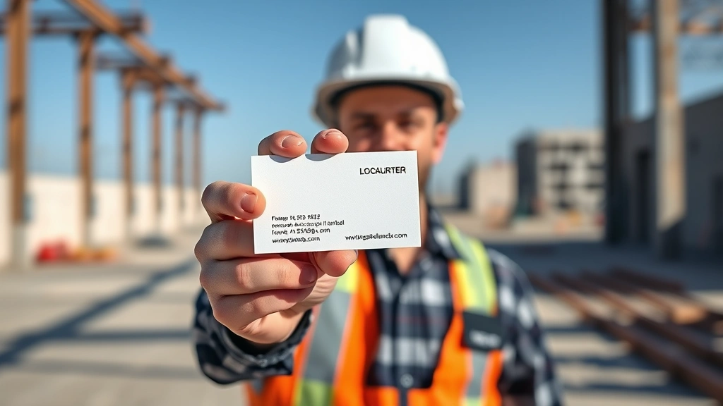
Your construction company business card is often the first tangible impression potential clients and partners have of your brand. In an industry built on trust, reliability, and professionalism, a well-designed business card communicates these values instantly. Unlike digital marketing channels that disappear from memory within seconds, a physical card sits on a desk, in a wallet, or on a bulletin board—serving as a constant reminder of your services and credibility.
Construction business cards face unique challenges. They must withstand job site conditions, convey technical competency, and stand out in a competitive market where dozens of contractors compete for the same projects. The right design elevates your professional image, while poor execution can undermine your expertise before you even speak with a prospect.
This comprehensive guide explores the strategic elements, design principles, and practical considerations that transform a construction business card from a mere contact exchange tool into a powerful marketing asset that generates leads and reinforces your brand identity.
Core Design Principles for Construction Industry
Construction business cards demand a fundamentally different approach than creative or retail industry cards. Your design must communicate competence, stability, and professionalism within seconds. The construction industry values clarity and straightforwardness—your card should reflect these core values.
Start with a clean, uncluttered layout. Construction professionals appreciate efficiency and directness. Avoid excessive decorative elements that might suggest frivolity or lack of focus. Instead, use strategic white space to guide the reader’s eye toward critical information. A well-organized card with breathing room appears more professional than one crowded with graphics and text.
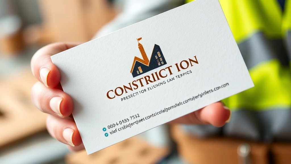
Incorporate your company logo prominently, but with restraint. The logo should occupy approximately 20-30% of the card’s real estate. Position it consistently—typically top-left or center—to create immediate brand recognition. If your logo includes a tagline, ensure it remains legible at business card dimensions. Test your design at actual card size before finalizing production.
Consider implementing a strategic brand analysis to ensure your card design aligns with your overall business positioning. Your card should reflect the same professionalism evident in your business insurance documentation and corporate materials.
The visual hierarchy matters enormously. Your name and title should be immediately visible. Secondary information—company name, phone number, email—follows naturally. Contact details should be arranged logically, typically in the lower portion of the card. This intuitive organization helps recipients quickly locate specific information.
Color Psychology and Material Selection
Color choices carry significant weight in construction business cards. The industry traditionally favors colors that convey trust, reliability, and professionalism: navy blue, charcoal gray, black, and earth tones like burnt orange or sage green. These colors resonate with construction values and differentiate your brand from competitors using trendy or overly bright palettes.
Navy blue remains the most popular choice for construction business cards. It communicates stability, trustworthiness, and professional authority. Charcoal gray offers a sophisticated alternative that photographs well and maintains legibility across various lighting conditions. Black text on white or light gray backgrounds ensures maximum readability on job sites with varying lighting.
Consider using accent colors strategically. A secondary color—perhaps your company’s signature brand color—can highlight your logo or border elements without overwhelming the design. Limit your palette to two or three colors maximum. Construction clients appreciate restraint and clarity; excessive colors suggest lack of focus or professionalism.
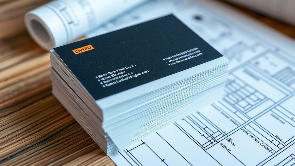
Material selection dramatically impacts durability and perceived quality. Standard 14-point cardstock works adequately for most applications, but construction professionals benefit from heavier stocks—16-point or 20-point cardstock—that withstand job site handling. Your card will be shoved into tool belts, wet pockets, and truck dashboards; premium materials communicate that your business warrants investment in quality.
Explore specialty finishes that enhance durability. Matte finishes reduce glare and provide a sophisticated appearance that contrasts beautifully with metallic accents. Glossy finishes offer vibrancy but can appear less professional in construction contexts. Textured finishes—linen, felt, or embossed patterns—create memorable tactile experiences that make your card more memorable.
Consider matte lamination as a protective layer. This coating shields your card from moisture, dirt, and wear while maintaining a professional appearance. For premium positioning, spot UV coating—applying glossy finish selectively to specific design elements—draws attention to your logo or key information while maintaining overall sophistication.
Typography and Readability Standards
Typography profoundly affects how your construction company business cards are perceived. Select professional typefaces that communicate stability and competence. Serif fonts like Garamond or Times New Roman convey tradition and reliability, while sans-serif fonts like Helvetica, Arial, or modern alternatives like Montserrat offer clean, contemporary aesthetics.
Avoid decorative or script fonts entirely. Construction professionals need information they can read quickly, often in poor lighting conditions or while wearing safety glasses. Your typography should prioritize legibility over creativity. This principle aligns with the structured approach required in business case documentation—clarity and directness matter most.
Maintain consistent font sizing and hierarchy. Your name should be the largest text element, typically 14-18 point. Your title and company name should be slightly smaller, approximately 10-12 point. Contact information can be reduced to 8-10 point, but should never fall below 8 point, as smaller text becomes illegible in typical viewing conditions.
Ensure sufficient contrast between text and background. Black or dark gray text on white or light backgrounds provides optimal readability. Avoid reversing light text onto dark backgrounds unless absolutely necessary—this reduces legibility and appears less professional in construction contexts. If you must use reversed text, limit it to headlines or logos only.
Line spacing (leading) significantly impacts readability. Cramped text appears unprofessional and difficult to read. Allow adequate breathing room between lines, typically 1.5 times the font size. This generous spacing improves legibility while reinforcing a perception of quality and attention to detail.
Essential Information Architecture
Your construction business card must include specific essential information, strategically organized. At minimum, include your name, job title, company name, phone number, email address, and physical address. Determine which information takes priority based on how prospects will most likely contact you.
Phone numbers deserve prominent placement. Construction clients often prefer calling over email. Consider making your phone number slightly larger or using a subtle visual element to draw attention. Include both mobile and office numbers if applicable, clearly labeling each.
Email addresses should be professional and company-specific. Generic Gmail addresses undermine credibility; clients assume established construction companies maintain professional email infrastructure. Your email should follow the format name@yourcompanyname.com or similar professional structure.
Physical address carries particular weight in construction. Clients want to know you maintain an established location. Include your street address, city, state, and ZIP code. If you operate from a home office, consider using a business address or mailbox service to maintain professional perception. Alternatively, you might list your primary service area instead of a physical office.
Website and social media information should be included if professionally maintained. A company website demonstrates stability and online presence. LinkedIn profiles add credibility for business-to-business connections. However, only include social media handles if you actively maintain them—outdated social profiles damage credibility more than no social presence.
Consider QR codes strategically. A QR code linking to your portfolio, service list, or contact form adds modern functionality without cluttering the design. Position it in a corner, making it optional rather than central to the card’s layout. Ensure the QR code remains legible by maintaining adequate white space around it.
Premium Finishes and Durability Features
Construction business cards face harsh conditions that require premium production choices. Standard business cards often deteriorate quickly on job sites; investing in durability demonstrates commitment to quality and professionalism.
Plastic or composite cardstock options provide exceptional durability. These materials withstand moisture, dirt, and rough handling far better than traditional cardstock. While more expensive than standard options, they communicate premium positioning and durability—qualities construction clients value. Plastic cards remain legible even after exposure to water, mud, and construction site conditions.
Raised printing or embossing adds tactile sophistication. When recipients hold your card, they immediately perceive quality and attention to detail. Embossed logos or company names create memorable physical experiences that differentiate your card from competitors’ flat designs. This technique works particularly well with premium cardstock.
Foil stamping—applying metallic finishes to specific design elements—creates stunning visual impact. Gold, silver, or copper foil draws attention to your logo or company name while adding perceived luxury and professionalism. However, use foil stamping sparingly; overuse reduces impact and can appear gaudy rather than professional.
Edge treatments enhance durability and aesthetics. Rounded corners appear more sophisticated than sharp edges and reduce the likelihood of card damage during handling and storage. Gilded edges—applying metallic coating to card edges—create premium visual impact that immediately signals quality.
Thickness communicates quality directly. Standard 14-point cardstock feels flimsy compared to 20-point or 24-point options. Heavier cards feel more substantial in hand and convey that your business commands premium pricing and professional standards. The tactile experience of holding a quality card influences perception significantly.
Brand Consistency and Professional Presentation
Your construction business card must align seamlessly with your broader brand identity. Inconsistent branding across business cards, letterhead, vehicles, and digital platforms undermines professionalism and damages trust. Your card should reflect the same visual language evident in your company website, proposal templates, and marketing materials.
Maintain consistent color usage. If your company’s brand guidelines specify particular colors, replicate them exactly on your business card. Color consistency builds recognition and reinforces brand identity across touchpoints. This alignment matters as much as the organizational consistency demonstrated through workplace practices.
Your logo should appear identical across all applications. If your logo has different versions for different backgrounds, ensure the business card version remains true to brand guidelines. Never stretch, distort, or modify your logo to fit card dimensions. Professional logo design accommodates various applications, including business card sizing.
Typography consistency reinforces brand identity. Use the same font families on your business card as on your website and marketing materials. This consistency creates visual harmony and strengthens brand recognition. When recipients see your card and later visit your website, the familiar typography immediately reinforces brand connection.
Consider how your business card integrates with your broader marketing strategy. Your card should complement your overall brand positioning, whether you position as a premium, high-end construction company or a value-focused contractor. Design choices—materials, finishes, colors, typography—should all support your intended market positioning.
Professional presentation matters equally to design quality. Store cards in a quality business card case. Present cards with your right hand, card-side facing the recipient. In construction contexts, ensure your hands are clean before exchanging cards. These professional courtesies, combined with a well-designed card, create powerful first impressions that establish credibility and professionalism.
Digital Integration and Modern Elements
Modern construction business cards increasingly incorporate digital elements that enhance functionality and engagement. While the physical card remains essential, integrating digital capabilities creates competitive advantages in an increasingly connected industry.
QR codes represent the most practical digital integration. A QR code linking to your portfolio website allows prospects to immediately view your completed projects, testimonials, and service offerings. This seamless bridge between physical and digital experiences demonstrates technological sophistication and provides immediate value. Ensure your QR code links to mobile-optimized content, as most people scan codes with smartphones.
NFC (Near Field Communication) technology offers advanced options for premium positioning. An NFC-enabled card transfers your contact information directly to a recipient’s smartphone when they tap the card. This technology remains relatively uncommon in construction, positioning early adopters as innovative and forward-thinking. However, NFC technology adds significant cost, so consider your target market carefully.
Your website URL should be prominent and professional. Ensure your website represents your business well—construction clients will visit immediately after receiving your card. A professional website with portfolio images, service descriptions, and customer testimonials significantly increases conversion probability. Your website should align with your professional development and growth strategy.
Social media integration can work if your profiles are actively maintained and professionally curated. Construction clients increasingly research companies on social media before making hiring decisions. If you include social media handles, ensure your profiles showcase your best work, provide value to followers, and maintain professional tone. Outdated or unprofessional social media profiles damage credibility more than no social presence.
Consider designing your card with digital photography in mind. Many people photograph business cards before storing them. Ensure your design photographs well under typical lighting conditions—avoid designs that become illegible in photos. A card that photographs clearly remains accessible even if the physical card is misplaced.
Digital contact management systems appreciate consistent formatting. Ensure phone numbers, email addresses, and website URLs follow standard formats that digital contact managers can easily parse. Proper formatting ensures your contact information syncs correctly to recipients’ phone contacts, enhancing professional perception and accessibility.
FAQ
What size should construction business cards be?
Standard business card size is 3.5 x 2 inches (88.9 x 50.8 mm). This size fits standard card holders, wallets, and Rolodex systems. While custom sizes are available, standard dimensions ensure your card integrates seamlessly into recipients’ existing organizational systems. Unusual sizes, while potentially memorable, often end up in drawers rather than card holders.
How many colors should I use on a construction business card?
Limit your color palette to 2-3 colors maximum. Construction business cards benefit from restrained color usage that communicates professionalism and clarity. Your primary color should be your logo color, with one or two accent colors used strategically. This restraint creates sophisticated, professional appearance that resonates with construction clients.
Should I include a photo on my business card?
Professional headshots can enhance personal credibility, particularly for sole proprietors or key decision-makers. If including a photo, ensure it’s professional-quality, well-lit, and appears trustworthy. Construction clients often prefer doing business with people they recognize. However, photos take valuable real estate on a business card; ensure your card doesn’t become cluttered. Consider including photos only if they genuinely enhance your positioning strategy.
What’s the best paper stock for construction business cards?
16-point to 20-point cardstock provides optimal balance between durability and cost. Plastic or composite materials offer superior durability for job site conditions. Matte finishes provide sophisticated appearance while reducing glare. Avoid glossy finishes unless paired with premium materials. Heavier stocks communicate quality and durability—values construction clients appreciate.
How often should I reorder business cards?
Order business cards in quantities that you’ll distribute within 6-12 months. Construction companies evolve—phone numbers change, addresses shift, service offerings expand. Outdated business cards damage credibility. Reorder before running completely out to maintain consistent availability. Track distribution to understand how many cards you typically distribute annually, then order accordingly.
Can I design my own construction business card?
While DIY design is possible, professional design typically yields superior results. Professional designers understand design principles, typography hierarchy, and production requirements that ensure your card photographs well and prints correctly. The modest investment in professional design—typically $100-500—pays dividends through improved professionalism and client perception. Alternatively, use high-quality design templates from reputable sources if budget constraints prevent professional design.
What information should I prioritize on my construction business card?
Prioritize your name, title, phone number, and company name. These elements should be immediately visible and legible. Secondary information—email, address, website—can be slightly smaller but should remain clearly readable. Construction clients typically prefer calling over email, so ensure your phone number receives prominent placement and clear formatting.
Should construction business cards include my license number?
Including relevant license numbers (contractor license, professional certifications) can enhance credibility, particularly if space permits. However, this information is optional. If including license numbers, ensure they’re legible and properly formatted. Verify that displaying license numbers complies with your state’s regulations and industry standards.